Creating Product Comparison Pages dives into the world of e-commerce, exploring the significance of comparing products in various industries. From designing visually appealing tables to writing compelling product descriptions, this guide covers all you need to know to create effective comparison pages.
Introduction to Product Comparison Pages: Creating Product Comparison Pages

Product comparison pages are a key feature of e-commerce websites that allow shoppers to evaluate multiple products side by side. These pages provide detailed information on product specifications, prices, reviews, and more, helping consumers make informed purchasing decisions.
Importance of Product Comparison Pages
Product comparison pages are essential for e-commerce websites as they enhance the shopping experience for customers by simplifying the decision-making process. By presenting all relevant information in one place, these pages save time for consumers and increase trust in the website. Additionally, product comparison pages can lead to higher conversion rates and customer satisfaction.Examples of industries where product comparison pages are commonly used include:
- Electronics: Websites selling smartphones, laptops, cameras, and other gadgets often feature product comparison pages to help customers choose the best device for their needs.
- Travel: Booking platforms allow users to compare flights, hotels, and rental cars to find the most suitable options at the best prices.
- Insurance: Insurance companies provide product comparison pages to help individuals compare different policies and coverage options before making a decision.
Designing Product Tables
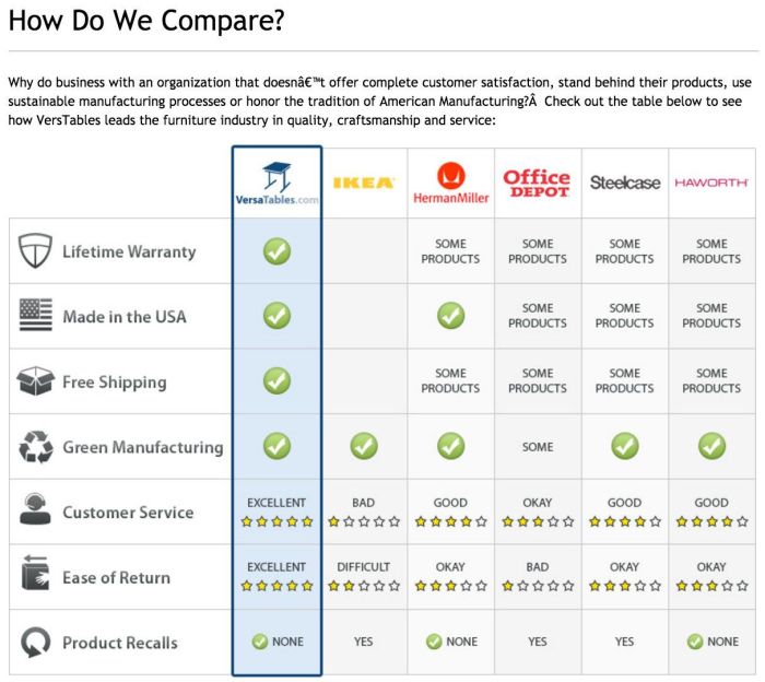
When it comes to creating product comparison pages, having clear and organized tables is key. Product tables help users easily compare different features, prices, and specifications of various products in one place. Here are some tips on how to design visually appealing tables for product comparison:
Importance of Clear and Organized Tables
- Use clear headings for each column to easily distinguish between different product features.
- Keep the table layout simple and clean to avoid overwhelming users with too much information.
- Highlight key differences between products using colors or bold text to draw attention to important details.
Tips for Designing Visually Appealing Tables
- Choose a clean and minimalistic design for the table to enhance readability.
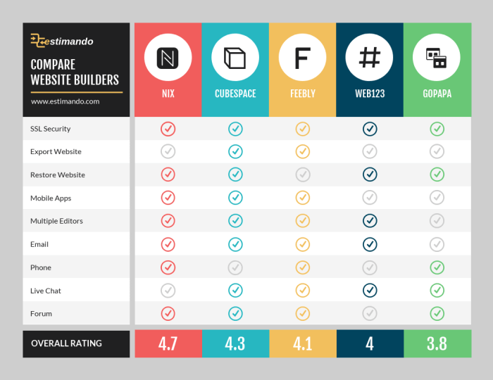
- Use alternating colors for rows to improve the visual appeal and make it easier for users to follow along.
- Include images or icons next to product names to provide a visual representation of each item.
Examples of Effective Product Comparison Table Layouts
| Product | Price | Features | Rating |
|---|---|---|---|
| Product A | $100 | Feature 1, Feature 2, Feature 3 | 4.5 |
| Product B | $120 | Feature 1, Feature 3, Feature 4 | 4.0 |
Choosing Comparison Criteria

When creating product comparison pages, selecting the right criteria is crucial for providing valuable information to consumers. It helps them make informed decisions based on their specific needs and preferences.
Relevance of Criteria
To ensure the effectiveness of product comparisons, it is essential to choose criteria that are relevant to the target audience. Consider factors that directly impact the user experience or determine the product’s performance. This includes both essential features that are commonly expected in the product category, as well as unique attributes that set certain products apart from others.
- Price
- Quality
- Brand reputation
- Product specifications
- User reviews
- Availability of customer support
Examples of commonly used criteria in product comparisons:
Writing Compelling Product Descriptions
When it comes to creating product comparison pages, writing compelling product descriptions is key to helping consumers make informed decisions. A well-written product description can highlight the key features of a product and persuade potential buyers to choose one product over another.
Tips for Writing Concise yet Informative Product Descriptions
- Avoid using jargon or technical language that may confuse the reader.
- Focus on the benefits of the product rather than just listing its features.
- Use descriptive language to paint a clear picture of how the product can improve the consumer’s life.
- Keep the description concise and to the point, highlighting the most important aspects of the product.
Importance of Highlighting Key Features
- Key features help consumers quickly understand what sets a product apart from others in the market.
- Highlighting key features can showcase the unique selling points of a product and attract potential buyers.
- By focusing on key features, you can effectively communicate the value proposition of the product to consumers.
Examples of Compelling Product Descriptions
“Experience the ultimate gaming performance with our state-of-the-art graphics card, delivering unparalleled speed and precision for an immersive gaming experience like never before.”
“Our revolutionary smartwatch combines sleek design with cutting-edge technology, keeping you connected and organized on the go.”
“Get salon-quality hair at home with our advanced hair dryer, featuring multiple heat settings and a lightweight design for effortless styling.”
Adding Visual Elements
Adding visual elements like images and videos can greatly enhance product comparison pages by providing a more engaging and informative experience for users. Images can help showcase the different features and designs of products, while videos can demonstrate how products work in real-life situations. These visual elements can help consumers make more informed purchasing decisions and increase their overall satisfaction with their chosen product.
Role of Images and Videos
Visual elements play a crucial role in product comparison pages by providing a more comprehensive view of the products being compared. Images can show the size, shape, color, and other physical attributes of the products, helping users understand the differences between them. Videos, on the other hand, can demonstrate the products in action, showcasing how they perform and highlighting their unique features.
By incorporating images and videos, product comparison pages become more visually appealing and engaging for consumers.
Guidelines for Integrating Visual Elements, Creating Product Comparison Pages
- Use high-quality images and videos to ensure clarity and detail.
- Include multiple images from different angles to provide a complete view of the products.
- Use videos to demonstrate key features, functionalities, and benefits of the products.
- Ensure that visual elements are relevant and directly related to the comparison criteria.
- Place images and videos strategically within the product comparison page to enhance user experience.
Examples of Visually Appealing Product Comparison Pages
- A product comparison page for smartphones that includes high-resolution images showcasing the design, display, and camera features of each phone.
- A product comparison page for laptops with videos demonstrating the performance, battery life, and portability of each model.
- An electronics comparison page with interactive images allowing users to zoom in and explore different components of the products.
